DennisJones
eclectic artwork & other random things
Flight Of The BumbleBee
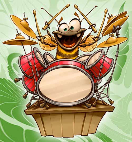
I am currently working on a really fun job that has one smokin’ hot bug jazz band in it. This is the drummer… who is apparently a bit over caffeinated.
The Creature From The Black Lagoon

This is a quick bit of art I just did for my church. It looks like the sermon series right after Christmas is headed off in a very traditional direction.

Game Guide

Another image for the board game. This is the little fellow that guides us through the game.
You Reap What You Sow
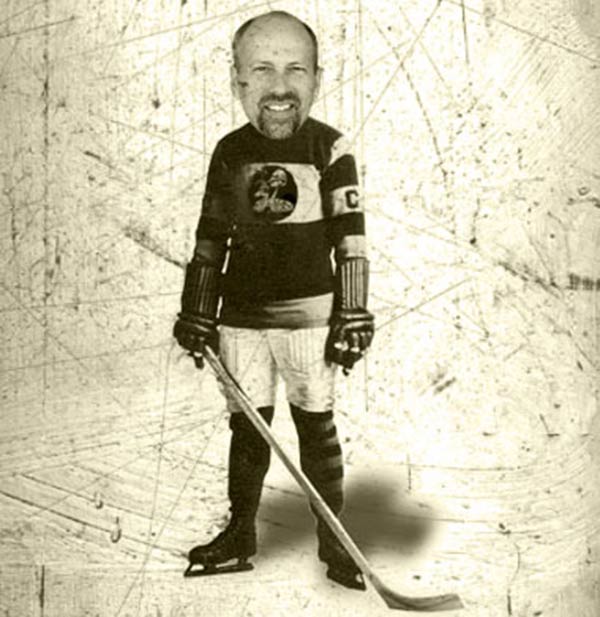
I go to church on Sunday mornings and play in an ice hockey league on Sunday nights. Yesterday morning we had a very good sermon on the Biblical principal that you will reap what you sow. I came home, slept through most of the football game on TV and then headed off to my hockey game.
It was a typical game for me chocked full of bad decisions, poor passing and blown shots. I was playing defense so I was not exactly the other teams favorite guy. One young man tried his best to get me to fight, (I laughed out loud), I got hacked with sticks, was constantly sprawled on the ice in a tangle of players and one nice fellow cross checked me in the back into the boards extremely hard (I’m pretty sure my feet were over my head at some point in that one).
I did land in the penalty box one time for tapping a gentleman lightly with my stick, but I’m sure that was all just some sort of terrible misunderstanding.
When I got home my wife asked me how the hockey game went. I went over the game highlights with her (we won 8 to 3) and then she asked me if I had reaped what I had sown during the hockey game.
I’m pretty sure I did…
Mike And Mike In The Morning

Mike And Mike is a sports radio show that I listen to on most mornings. Mike Golic is a former NFL lineman, so he’s a pretty big guy. His partner Mike Greenberg is NOT a former NFL lineman so he’s a smaller sort of guy. Together they combine to do a really entertaining talk show.
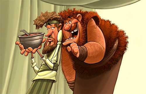
I do a lot of Biblical artwork. Since I have no idea what these Biblical people actually looked like, my job is to come up with plausible looking characters to represent them. I recently worked on a series of pictures about Jacob (an indoor, hang around the house sorta guy) and his brother Esau (a big, hairy outdoor kinda guy). As I was trying to figure out what these two should look like, Mike and Mike was playing on the radio in the background. Then it hit me, Jacob and Esau would probably look a lot like Mike Golic And Mike Greenberg. So this is my Mike And Mike inspired Jacob and Esau picture.
Mello Yellow

One of the smaller sized characters I created for the board game I’m currently working on. As this project moves closer to a publishing date, I can share more information about it.
Doctor Luke
Another process video of something I did recently. Basically just blocking in color underneath the drawing and then putting finishing touches in on top of it.
Lizard King
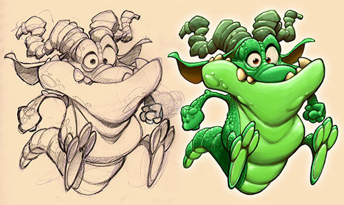
One of the medium sized characters for the board game.
Sea Monkeys
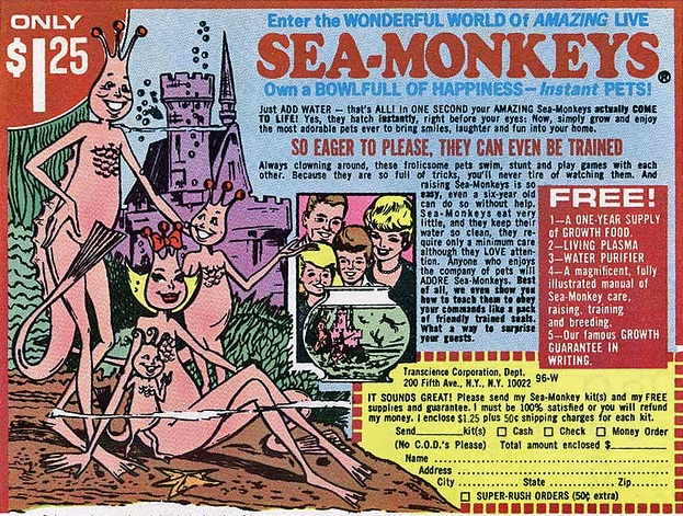
When I was a kid I loved comic books and those old comic books had some pretty interesting ads in them. You could buy a 7 foot long Polaris submarine that fired rockets and torpedoes for only $6.98, real x-ray vision glasses for $1.98, a darling pet monkey for $18.95 and all sorts of other valuable items… but the thing that fascinated me most were the Sea Monkeys.
For only $1.25 you could enter the wonderful world of Amazing Live SEA MONKEYS!! As the ad in the comic book said, Own A Bowlful Of Happiness – Instant Pets!! The picture showed a happy family of some sort of pink sea people. According to the ad, Sea Monkeys were always clowning around, doing stunts and playing games with each other, AND, because they were so full of tricks, you would never tire of watching them, AND (as if all that were not enough), they would even show you how to teach them to obey your commands like a pack of friendly trained seals!!
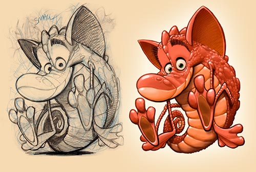
I was crushed to later find out that Sea Monkeys were actually microscopic brine shrimp that usually died in about a week. When I designed this character for the board game I’m working on, I pretty much built a prototype of what I think a good solid Sea Monkey aught to look like.
RedWood Rider
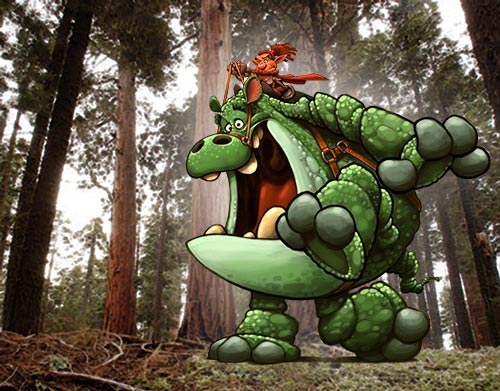
I wanted to get a size relationship on one of these creatures I created, so I tossed a guy on his back and put him next to a stand of redwood trees.
Big Brother

Another creature from the board game I’m working on. This is one of my big guys. I think gamers refer to fellows like this as “tanks”.
Little Red Robbing Hood

Another one of the animals I came up with for the board game I’m working on. There will be four little teams of varmints with three characters on each team. I decided there should be a small, medium and large creature on each team. Here is one of the small animals I came up with.
Frequent Flyer Fryer
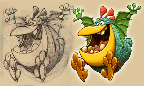
Here is another one of the characters I came up with for the board game I’m working on. Kind of a flying chicken I guess…
Green Jumper
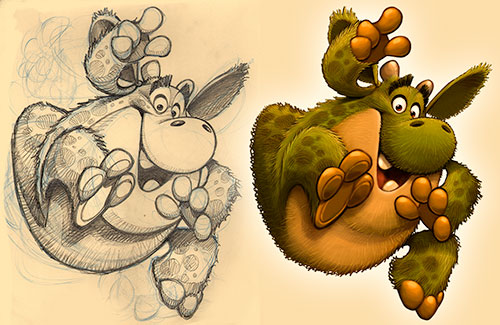
I am currently working on a really fun project. It is a boxed board game and part of the project calls for me to developing twelve wacky looking animals. My client has graciously said that I could share some of this work here on my blog, so here is one I just finished up.
Fool Proof

Nothing is foolproof to a sufficiently talented fool.
BIBLICAL PORTFOLIO


EPIC FANTASY PORTFOLIO


FANTASY ANIMAL PORTFOLIO


VEHICLES PORTFOLIO


SPORTS PORTFOLIO


HISTORICAL PORTFOLIO


RANDOM PORTFOLIO


CREATURES PORTFOLIO


